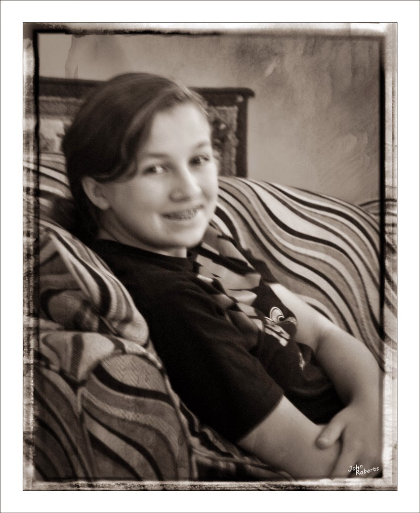
My job was to try to get it back to the way it originally looked. That would, of course, involve restoring the color and contrast. That's easy enough with modern software, but the challenge is, how much? It's easy to get carried away and overdo it, ending up with clownish colors that are nowhere near the original. Not knowing what the original looked like, I just try to use my best judgement, using whatever clues are available. Personally, I think it's better to err on the side of understatement on the vibrancy of colors and the contrast. I try to get the skin tones looking natural, and let the other colors fall where they may.
This photo did not have any other physical damage, so color and contrast were the only two factors I had to deal with. After much tweaking, I came out with the above result (click on photo to enlarge). I think it looks very much like portraits of that era, and printed on archival paper, should endure the passage of time with more grace than the original photo. I enjoy restoring these old photos of loved ones, and giving back clearer memories of the way they were.


