Wednesday, October 29, 2014

Depot For Sale

Saluda Depot Detail

If anyone is looking for a train depot to buy, I found a nicely restored and renovated one for sale in Saluda, NC. The trains don't run through Saluda anymore, but it's a cool building that should be good for some retail shops. If I were rich, I might make a home out of it! (Click on photos to enlarge.)

Saluda Train Depot


Tuesday, October 28, 2014

Sunday, October 26, 2014

More Rural Scenery

Along The Virginia Creeper Trail  -  2014
(Click on photo to enlarge.)

Friday, October 24, 2014

Creepin' In Virginia

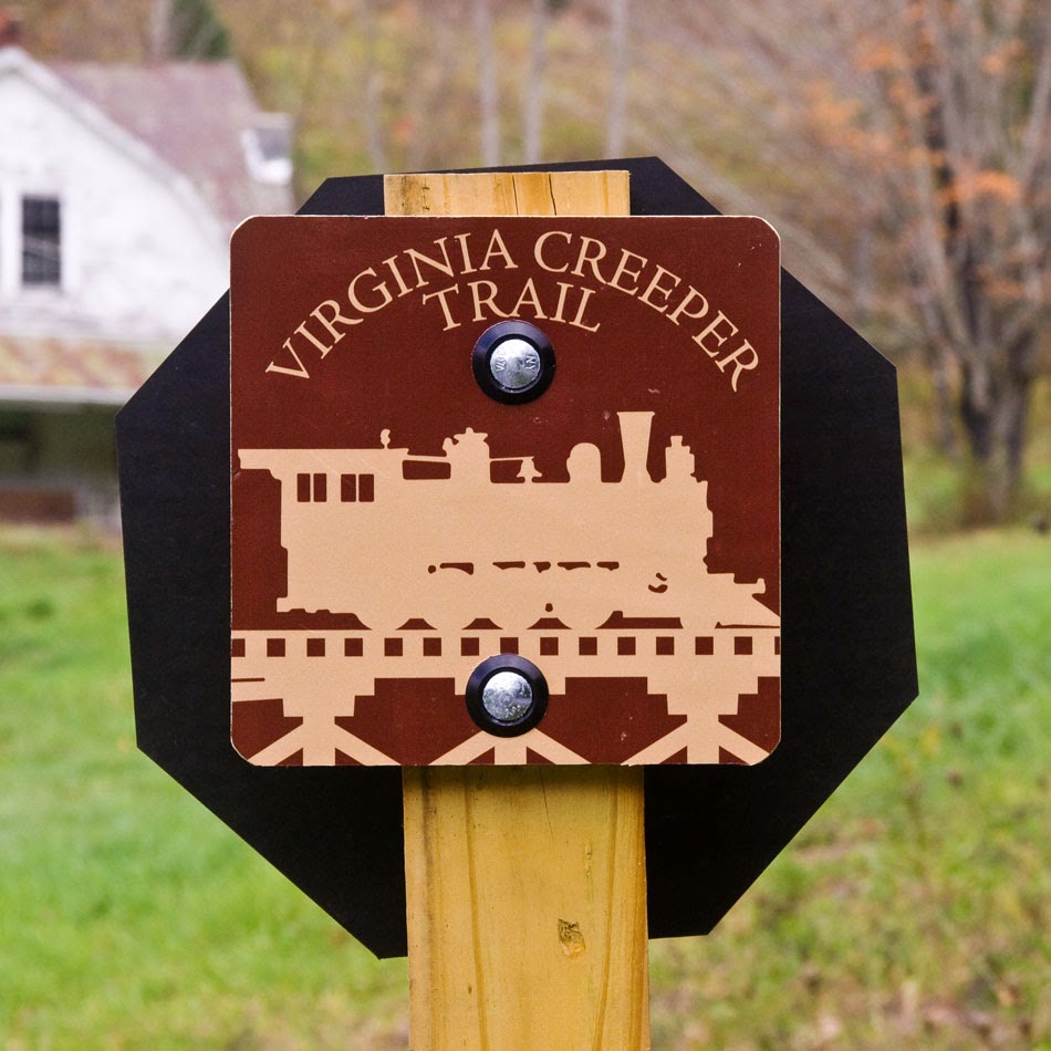
I spent yesterday bike riding on the Virginia Creeper Trail which runs 34 miles from Whitetop Station to Abington. It's possible to do the whole trail by bike in one day, unless you're making frequent stops for pictures. We took all day to get to the half way point at Damascus, VA. One of our party, Jimmy Wilson, did the second half from Damascus to Abington in 1 hour 41 minutes, which gives you an idea of what a leisurely pace we were maintaining.


The trail follows the route of an old railroad spur through the mountains. The train got the nickname "Virginia Creeper" from it's slow pace over the mountainous terrain. The Creeper carried freight and passengers from the 1880s to 1977. The route is now a popular trail for bikers and hikers, although bikers definitely outnumber the hikers by a huge margin. It's especially popular at this time of year among leaf lookers like me. Here's some of yesterday's photo take (click on photos to enlarge):

We used one of several shuttle services in Damascus to take us and our bikes up to Whitetop Station, the eastern end, and highest point of the trail.

My biking companions for the day, Jimmy and Glenda Wilson, and my neighbor, Ken Johnson.

Glenda took this photo of me and the guys: Ken, me, and Jimmy. These photos were made in a pumpkin patch that was filled with harvested, but yet to be collected pumpkins.

A view of the trail near Whitetop Station. We found the trail to be very well maintained in spite of heavy traffic and recent wet weather.

Some of the pretty rural scenery along the trail

Green Cove Station, a railroad station about a quarter of the way to Damascus. Inside were artifacts and pictures from the railroad's heyday.

One of the many trestles along the route viewed from below

Having another photo bug with me allowed me to get into some of the pictures for a change. Ken took this one near one of the original mile markers - 23 miles from Abington.

Another trestle - Number 18 - with some fall foliage

An "action" shot Ken wanted to try. Actually, I was trying to maintain balance on a stationary bike. I think it came out good, so maybe I shouldn't have given away how we really did it.

Many of the trestles looked like footbridges to me. This was my favorite one because it looks like what I think train trestle should look like.

One more of me, at a pretty spot along a mountain stream.

Wednesday, October 22, 2014

Friday, October 17, 2014

Thursday, October 16, 2014

Wednesday, October 15, 2014

Tuesday, October 14, 2014

Monday, October 13, 2014

Friday, October 10, 2014

Thursday, October 9, 2014

Don't Dis My Point and Shoot

Maggie Valley, NC - October, 2014
(Click on photo to enlarge.)

"I can't use a point and shoot because ____________ ." You'll hear variations of that statement from avid amateurs and wannabe pros all the time. And I agree that there are times when I appreciate the versatility and capability of my DSLR. However, the little point and shoot that we often sneer at is capable of admirable quality if we do our part. The photo above was made with a Canon A2000, a tyro's camera with six year old technology. Just as the stove doesn't make the chef, the camera doesn't make the photographer.

Monday, October 6, 2014

The First Ones

October is here, the days are getting cooler, and the annual Fall color show is in its first stages. The overall color of the mountains is still green right now, but there is an increasing yellowish cast beginning to emerge. Here and there one can even find some red and orange on individual trees.

On my way into Waynesville Saturday morning, I decided to explore some back roads to see how things were progressing. I was looking for those first few examples of the emerging Fall show. I found this lone tree in a pasture, side lit by the morning sun. It appeared to glow against the wooded hill behind it which was still in shadow at this early hour. The grass, shrubs, and most of the other trees in the area are still green, but this lone tree is showing off its Fall glory already. Soon it will be joined by thousands upon thousands of others as the mountains erupt in color in a few short weeks. And I'll be watching.

Lone Tree, Waynesville, NC  -  2014
(Click on photo to enlarge,)

Sunday, October 5, 2014

A Little Off Topic Fun: Ugly Unis

None of the photos on today's post were made by me. I "borrowed" them to illustrate one of my pet peeves: ugly football uniforms. In recent years, many college football teams have tried to outdo each other with the most outlandish designs and color combinations. In my opinion, they are usually complete disasters when compared to the more traditional uniforms. Do you want to look good at the next big game? Then just follow my few simple rules:

1. Uniforms should incorporate only your school colors. This rule sounds basic enough, but we see it violated every week. If your school colors are scarlet and white, then don't wear unis with pink, black, burnt orange, etc. Stick to scarlet and white.


Right

Wrong

If black is one of your school colors, wear it. If black is not a school color, forget about it.

Colorado's colors are black and gold. Black looks good!

TCU's school colors are purple and white. Black looks terrible!

Some teams have gone to adding pink to their color scheme to support breast cancer awareness. Bad move. If you want to help a cause or charity, write a check. Wearing ugly gear is not helping anybody.

Write

So wrong

2. Helmet logos should be simple, and easy to discern from the stands. If the first response to your helmet logo is, "What in the world is that?", it's a fail. Football helmets are a team's primary identifier on the field. They should be distinctive, but easily recognizable by friend and foe alike. Again, simple and traditional usually works best. 

Last year, TCU tried to get cute with putting a red slash on their helmet to represent the blood that comes from a horned toad's eyes. The problem was, nobody got it. If you have to explain your helmet logo, it's a fail.

Right

Unbelievably Wrong

School colors are important with helmets too. Yesterday, Texas A&M lost their minds and thought chrome was one of their school colors. In the bright October sun, it may as well have been white on white. Maybe that's why they got housed by Mississippi State.

Uh, that would be  a "no".

3. Pants and jerseys should be contrasting colors. Some may argue with this one, but, hey this is my blog. I can't think of one example of a team who wears matching pants and jerseys that doesn't make me want to hurl. Even my NFL Saints look like a high school team with a small uniform budget when they wear all black. Contrast always looks better.

Looking Good

Pass the sickbag, please.

4. Don't try a new uniform every week. There's a reason why some uniforms have stood the test of time. Did you ever notice that the traditional football powers don't have a new uniform every week? Alabama (9 national championships in football) may have rather dull uniforms, but they are distinctive and recognizable because they've worn them for years. As soon as you see that crimson helmet adorned only with a number, you know it's Alabama. Likewise, schools like Ohio State, LSU, Oklahoma, USC, and other winners all stick with traditional uniforms with very few exceptions. On the other hand, Oregon (0 national championships in football) has a new (and ugly) uniform every week. Do we see a pattern forming here?

Winners

Identity Crisis

Looking good on Saturday is not hard. In fact, you have to work hard to look bad. Nike, UnderArmour, Adidas, etc. spend countless dollars and design hours making teams look awful. Just stick to a few simple rules as I've outlined here, and your team can look like a champion!

Friday, October 3, 2014

The Trouble With Titles

I read an interesting discussion yesterday on the Eric Kim Street Photography Blog concerning the captioning of photos. Two fairly well known photographers, Dan Winters and Constantine Manos, contend that a photo should be able to stand on its own, without a fancy back story, caption, or title. Manos like his photos to provide more questions than answers, allowing his viewers to fill in the blanks. He recommends including only a date and location with a photo, nothing more.

I agree that a photo should be able to stand on its own. One of my favorite English teachers once told us that a poet should never explain or interpret his own poetry. If he does, he has wasted his time putting his thoughts down in verse; he should have just written an essay. I feel the same way about photographs. Still, I usually feel obligated to give photos I post on this blog a title, and often a back story. I guess neither approach is wrong. The question is, does the photographer have enough confidence in his photo to let it stand alone, or does he feel he needs to add words to complete the story?

As an experiment, I am going to give today's photo only a date and location. No title (titling is often a pain anyway). No caption. No back story. I'll let you fill in the blanks.


Waynesville, NC  -  July, 2014
(Click on photo to enlarge.)

Wednesday, October 1, 2014

Discounted Inspiration

I like to make a trip to my favorite second hand book store, Mr. K's Used Books in Asheville, at least once a week. Over the years I have found some outstanding bargains in every category of books. The store has wide aisles, is well lit, has a large and varied selection, and has very helpful staff. Another plus is that it is less than a mile from where I work, making it a convenient stop on the way home.

I don't come home with a book on every trip to Mr, K's, but every so often I make a real find. Last week I found a copy of Supreme Instants, The Photography of Edward Weston for only $4.00! It is a softcover, but in pristine condition. It originally sold for $25.00 way back in 1986. I love a bargain!

I have seen dozens of examples of Weston's work, but this book contained several photographs I had not seen before. Among these were some photos of clouds that I thought were excellent. Now, I don't often get excited over cloud photos. Alfred Stieglitz's famous Equivalents series are among the most boring photos I have ever seen. Weston's clouds, however, inspired me to go back and do something with a cloud photo of my own that I made a few months back. I found this unusual formation while working down in Cherokee County on the highway between Andrews and Murphy. And by the way, all you big camera snobs, the original color photo was made with my little "point & shoot" Canon A2000.

Cherokee County Clouds, Cherokee County, NC  -  2014
(Click on photo to enlarge.)

This photo has been sitting in my "I'll do something with it one day" file where it might have lingered for months or even years. Weston's book inspired me to try to make a quality B&W photo out of it, and I am fairly pleased with the results. Inspiration for only $4.00 - I do love a bargain!